Picking your life’s path can be a challenge at any age. But I’ve always found it strange that our educational system forces you to make that kind of choice when you’re sixteen years old. When my high school guidance counselor asked me to choose between my two academic passions to fill out my college applications, I struggled to make a commitment to which career I’d prep for over the next four years. At the time, my biggest decisions were which Yes tape to pop into my 8-track or what pair of bell bottoms to step into to start my day.
There seemed no path open that would let me spend my life with both a paint brush and pen in my hand. So I chose art school. My time at RISD led to a career as an illustrator, a tour through graphic design, stints as a jack-of-all trades creative freelancer, and finally, somehow, back to writing again. I do a lot more of the latter than any of the former these days, but almost every time I finish a novel, I enjoy exploring the world I’ve built with words with color and form instead.
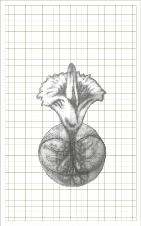
I got that itch with The Corpse Bloom around the time I was climbing toward’s the tale’s climax. The image of the story’s star flower and the kidneys that my protagonist was suturing every day began to meld in my mind. I started sketching until I got the icon that could combine both out of my system and onto the mocked-up cover that could let me visualize my dream of having my book end up in a reader’s hands. But though you’ll find echoes of that image in the final paperback and ebook, it turned out to be just the start of the final package for my prose.

If there’s one thing that working in advertising has taught me, it’s that even the best product doesn’t stand a chance if you can’t get somebody to pick the damn thing up off the shelf. So when I wrote “the end,” of the book, it was just the beginning of the job for the pros who could best position my work for sale. I followed my favorite publishing guru’s advice (thank you, Jane Friedman) and tracked down the artists at Damonza to give them a shot. That bet ended up paying off triple in a trio of selections for my cover that were so strong, I’m still having a hard time selecting the final one.
The first option these cover artists cooked up paid homage to my starting sketch. They zeroed in on my kidney-flower icon and cleared away the clutter to get it to work much better at the small scale the book’s thumbnail image would appear online. That presentation is critical for the story shoppers screening for their next read. The Damoza crew certainly knew a thing or two about using color to catch those eager eyeballs. They chose the chartreuse accents in my flower for the gruesome green type that stands out so well against the ghostly gray background they conjured to make my title pop from the page.
The second option Damonza showed me was even scarier. (And not just because of its wonderfully creepy vibe.) Somehow, the short flyleaf copy I shared with their team gave them a look straight into my brain. How else could they have created the haunted hallway I’d tread so often in my mind during the book’s later chapters, when my novel’s beleaguered surgeon was working the night shift to stay a day ahead of the cartel that might do him in?

Just when I thought these digital wizards had spun their best spell, I pulled up their last look for my book on my screen. The image was so sharp and strong, it cut straight to the heart of my story with the tool of my hero’s trade and traces of the hobby that helped anchor my tale’s theme. If Damonza had emailed me beforehand to tell me they were working on a cover featuring a scalpel and flower petals, I might have told them that the concept was too on-the-nose. But as soon as I saw it, I smelled a solution that looked like an absolute winner for the book.
With these covers in my inbox, I didn’t think twice about reaching out to Damonza’s team again to have them do the interior formatting for my book. Though I’ve spent half a lifetime as a digital artist, I’ve always been amazed at those designers who’ve mastered what I can’t: the intricacies of typography. When I received my first proof of the way the words I’d been pecking away at in Word for years would look in an honest-to-god book, I almost cried. The choice of the font, the weight of the type, the letter-spacing, line leading, indents—it all just looked so, right. Even the damn dingbats added something special to the way my words flowed across the page.

Seeing how one team of artists can interpret another’s work has been an absolute joy for me. I started The Corpse Bloom more than four and a half years ago, and though I’ve worked on other novels since then, it’s had the lion’s share of my time. I’ve lived with this book, slept with it, dreamed of it, and forced family, friends, and anyone else with an ear to bend to listen to me bitch and crow about it since then.
So seeing Damonza’s novel take on the fictional world I sketched between Boston, Maine, and the jungles of Mexico has been both a revelation and a relief. It’s reminded me what I hope this book—like any good one—can do for those who hold it in their hands: take them into the world I’ve created and bring it to life with all they bring to it from their own.

Cool insight into your cover process. Still a fan of option 2 but understand why you’re going with cover design 3. The scalpel is a strong image. And it harkens back to the X-Acto knife from your graphic design days!
LikeLike
Thanks for the feedback, Tim! Your early support for the “clinic” cover had me looking at that option again. As noted in the post, it really did channel the vibe in “The Night Shift” and the other chapters close to it later in the book designed to show the literal dark side of a medical practice gone bad.
LikeLike
Well done! 🙂
LikeLike
Thank you, Jane, the insights I found at janefriedman.com and in your book, “The Business of Being a Writer” put me on the path to this book. I am so grateful for the polished product both helped me create!
LikeLike